 Once pictures are put on the wall in a home, it starts to immediately feel more homely. I'd been planning a black gallery wall for a while now and the frames had been on a pile in the lounge room, taking up space, with me hoping that no one would step on them or smash the glass.
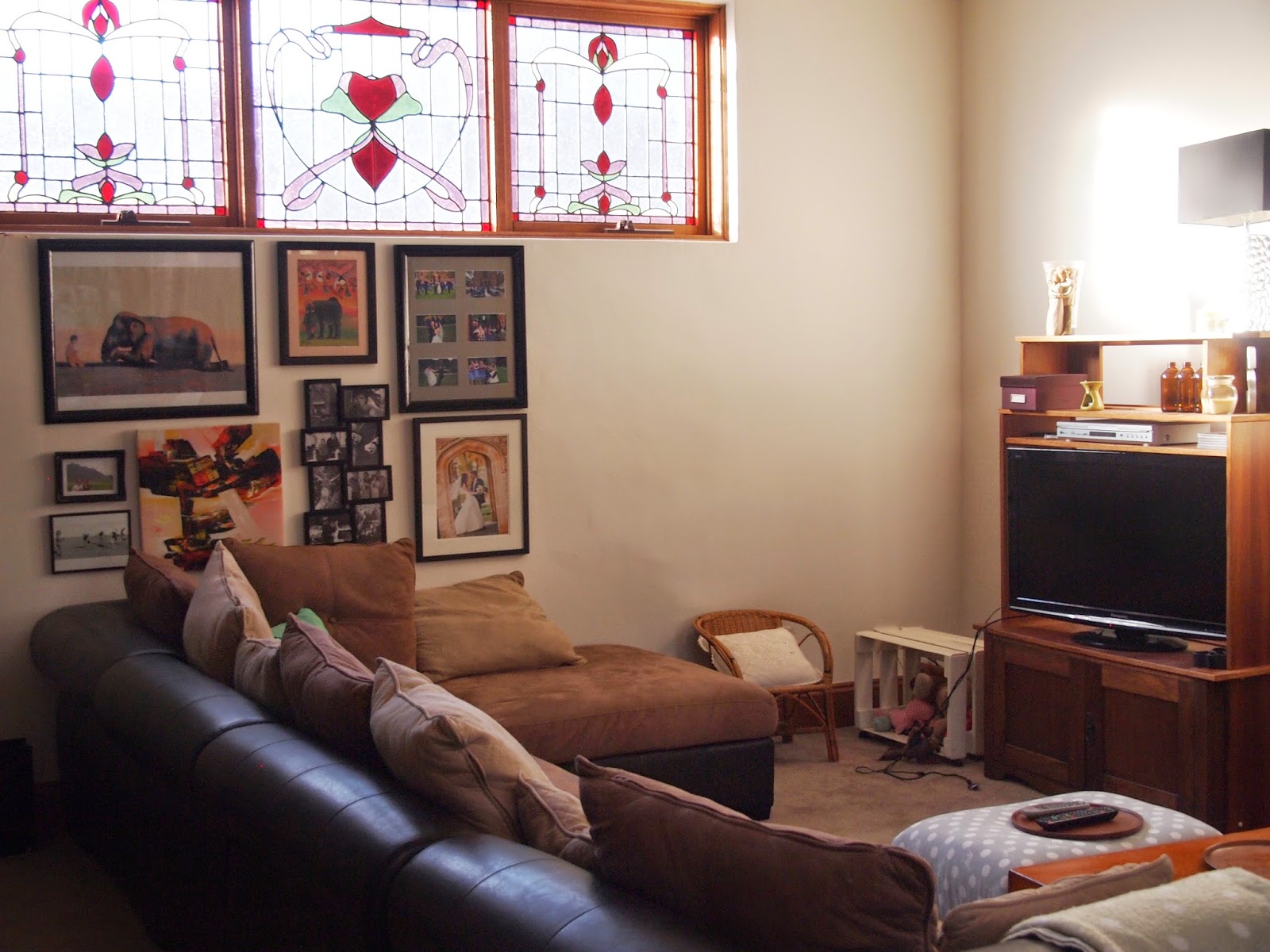
The lighting in the lounge room is a bit tricky as our house is built around a large glass atrium so there is a bit of glare during the day but not that much (see below photo for the reflections).
A few of the frames were actually brown (the elephant picture and the top right picture) but with two coats of black, they looked like they'd always been black and that saved me the $ of buying new frames and reframing the artwork. I really just collected every black or somewhat black framed piece of artwork/photograph that I own and worked out how best to arrange them. These pieces are all special to me and I'm thankful to be able to see them lots. The elephant picture is actually hand sewn by some people in Vietnam with disabilities and the painting below it was hand painted in Vietnam. The hippo painting was purchased in Zanzibar and the photos are all special snaps, including a few from our wedding.
It creates a nice focal point in our lounge room and something for guests to look at when they visit. While putting together a gallery wall can be a bit frustrating, we feel like the layout now is working for us. Our lounge room (which is a large room including the dining room and kitchen) is becomming more homely. I am a particular fan of the bird pillow too which was thrifted from a garage sale for $1. Apart from potentially adding a few more accessories to the television cabinet, I feel like this area is complete...although I am dreaming up some special shelving for an area of the wall...there are just too many great ideas and sources of inspiration out there! And just to show you the big change, here's a little before and after...
This probably isn't the best before and after snap ever as the lighting was much better in the before photo and it is hard to tell that the walls were actually a little apricot colour and now are white. However what you can tell from this after picture is that our evolving furniture and items are really starting to make the place feel more like us.. I'll just need to keep working on my photography skills!
This probably isn't the best before and after snap ever as the lighting was much better in the before photo and it is hard to tell that the walls were actually a little apricot colour and now are white. However what you can tell from this after picture is that our evolving furniture and items are really starting to make the place feel more like us.. I'll just need to keep working on my photography skills!
Lisa x
PS for details sake:
the couch - harvey normans (4 years ago)
Every other item thrifted


No comments:
Post a Comment